• Thanks for visiting The Penturners Forum today.

    There are many features and resources that currently you are unable to see or access, either because you're not yet registered, or if you're already registered, because you're not logged in.

    To gain full access to the forum, please log in or register now. Registration is completely free, it only takes a few seconds, and you can join our well established community of like-minded pen makers.

Coloured box

Dalboy

Executive Member
Joined
Mar 20, 2014
Posts
7,681
Location
Kent
First Name
Derek
Not done much in the way of turning lately.
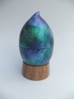
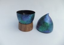
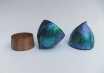
This is a piece that I started at the beginning of the week but went wrong a couple of times and had to repaint it. The main pod is Ash and the ring stand is cherry. The wife thought I was making a lemon well with all the problems I felt like one.
 

Attachments

  • DSCF7014 (2).JPG
    DSCF7014 (2).JPG
    108.9 KB · Views: 60
  • DSCF7011 (2).JPG
    DSCF7011 (2).JPG
    96.9 KB · Views: 61
  • DSCF7015 (2).JPG
    DSCF7015 (2).JPG
    101 KB · Views: 59

GeordieB

Registered
Joined
Dec 26, 2014
Posts
2,979
Location
halifax
First Name
george
Thats really nice Derek:thumbs::thumbs: hope you dont mind me saying I dont think the stand works mate but thats just my taste
 

Dalboy

Executive Member
Joined
Mar 20, 2014
Posts
7,681
Location
Kent
First Name
Derek
Thats really nice Derek:thumbs::thumbs: hope you dont mind me saying I dont think the stand works mate but thats just my taste

I have to agree with that I may even try and pierce it to make it look lighter and also so you can see the bottom of the box through it. It is sitting on the side where I can see it as this is where I can get the feel for it and see if it works or not, I do this with all of my pieces. It also gives the finish a chance to harden before putting it away.
 

AllenN

Fellow
Joined
May 20, 2013
Posts
2,243
Location
Lancaster, UK
First Name
Allen
I like that and to be honest I think the contrast between the 'egg' and the base works for me. The finish on the top is quite something and I love the shape.
 

Pierre

Graduate Member
Joined
Sep 2, 2015
Posts
999
Location
Southern Central France
First Name
Pierre
I've looked at this several times now and each time it has caused me to look askance, I think I know what it is now, the join of the 2 halves doesn't look right it seems to need a fine gold band 1-2mm either side of the join. Just a personal opinion after all aesthetics are in the eye of the beholder.

PG
 

Dalboy

Executive Member
Joined
Mar 20, 2014
Posts
7,681
Location
Kent
First Name
Derek
Thank you guys.

I've looked at this several times now and each time it has caused me to look askance, I think I know what it is now, the join of the 2 halves doesn't look right it seems to need a fine gold band 1-2mm either side of the join. Just a personal opinion after all aesthetics are in the eye of the beholder.

PG

I did think of making a break but decided I wanted the pattern to match and flow straight through. Thanks for your thoughts all the same
 

Walter

Moderator
Fellow
Joined
Apr 22, 2013
Posts
2,698
Location
Amble on the sunny Northumberland coast.
First Name
Walter
I rather like that Derek, reminds me I must dig out my Jo Sonja paints and do some more coloured work.

For what it's worth I agree with Geordie about the base but not with Pierre about the join. Just shows that Pierre is correct when he says that aesthetics are in the eye of the beholder.
 

Penpal

Grand Master
Joined
May 26, 2013
Posts
25,342
Location
Canberra AUSTRALIA
First Name
Peter
Be interested how you end up but that colouring allowed the top and bottom to come together so well. The base final result will make or break the final appearance.

Peter.
 
Warning! This thread has not had any replies for over a year. You are welcome to post a reply here, but it might be better to start a new thread (and maybe include a link to this one if you need to).
Top